


 Bishop Hill
 Marcott et al
Climate: MWP 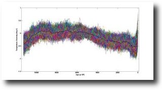 Just in the nick of time to be included in the final draft of the IPCC's Fifth Assessment report, we get...the new Hockey Stick, a paper by Marcott et al.
Surface temperature reconstructions of the past 1500 years suggest that recent warming is unprecedented in that time. Here we provide a broader perspective by reconstructing regional and global temperature anomalies for the past 11,300 years from 73 globally distributed records. Early Holocene (10,000 to 5000 years ago) warmth is followed by ~0.7°C cooling through the middle to late Holocene (<5000 years ago), culminating in the coolest temperatures of the Holocene during the Little Ice Age, about 200 years ago. This cooling is largely associated with ~2°C change in the North Atlantic. Current global temperatures of the past decade have not yet exceeded peak interglacial values but are warmer than during ~75% of the Holocene temperature history. Intergovernmental Panel on Climate Change model projections for 2100 exceed the full distribution of Holocene temperature under all plausible greenhouse gas emission scenarios.
I wonder how those 73 proxies were selected. I wonder which proxies have that extraordinary uptick at the end. And I wonder when the uptick actually started - it looks like 500 years ago to me.
New Scientist covers the paper here. Interestingly they reckon the temperature rise began in the late 19th century.
Then, in the late 19th century, the graph shows temperatures shooting up, driven by humanity's greenhouse gas emissions.
This seems odd, because it is generally understood that carbon dioxide emissions were too small to affect the climate before the 1950s.
It will be interesting to read the paper in full.
Bishop Hill
David Whitehouse reviews the paper here.
Reader Comments (72)
Abstract: warmer than during ~75% of the Holocene temperature history.
Editor: higher than those during 90% of the entire Holocene
Can't they get their lies to match?
Can you post a link to the chart?
I'm still waiting for open field agriculture on Greenland. Not to mention the wind harvest from Canada.
Interesting, I am sure something was posted about this at WUWT, referencing "dotearth" went back after checking here and there is no sign of it? Need the full paper
This seems odd, because it is generally understood that carbon dioxide emissions were too small to affect the climate before the 1950s.
But it's well known that warming can precede the CO2 rise that caused it.
Very convincing drawing.
I'm more convinced than ever of how silly this whole things is.
Andrew
This is only a broad schema from the "Editor's Note" but until they can explain causation for temperature changes throughout the Holocene, especially during 1810 - 1960 (a period when current hypotheses about human CO2 emissions driving temperature would not account for the changes, they are on shaky ground:
We'll have to see about their set of proxies, how accurate and sensitive the proxies truly are to changes in temp. This seems rather close to the "flat handle" of a Mannian hockey stick, perhaps not accounting for the actual variations in temp. 800 to 1500 AD.
Dot Earth quotes a *program director for ocean sciences at the National Science Foundation, which paid for the research*
"This research shows that we’ve [sic] experienced almost the same range of temperature change since the beginning of the industrial revolution as over the previous 11,000 years of Earth history.."
AGW started as soon as we put a match to coals? The original sin defined for their new religion.
If the uptick starts in the late 19th century it may be a proxy-instrumental splice.
Paul Matthews
Indeed.
The supplementary data are extensive and downloadable from the linked Sciencemag site as a pdf explanation and an excel data file. The proxies appear to have been largely pulled from previously published and crunched through a Monte Carlo simulation. All of it but especially the uptick area requires careful audit. Record numbers seem to drop off alarmingly in this region. Suspect splicing of instrumental record on the end a la 'Mike's Nature Trick'.
Just read David Whitehouse's analysis. Spot on. Looks like he actually read the paper. The BBC should employ him to bring back their respectability and authority.
Difficult to see from here, but if the width of that (Very Hungry) caterpillar graphic is supposed to represent error bars, then it looks to me that you can draw a straight horizontal line through the lot - suggesting that it shows nothing at all. Interesting that the spread seems wider as it approaches the current day though. If, on the other hand it's a load of individual traces, then the omitted error bars will be truly floor to ceiling... which means with a little more confidence that it shows... nothing at all.
And all this in the self-effacingly dubbed "World's Leading Journal of Original Scientific Research, Global News, and Commentary".
So when did Gerald Ratner become their Editor in Chief? I think we should be told.
Two quotes from interviews on the paper by Revkin at NYT:-
Michael Mann
Robert Rohde from BEST
Seems to be a certain lack of consensus already ........ and the ink's barely dry.
This is weird. In figs S5 and S6 there is no hs at all.
They use a time step of20 yrs, but the proxy time resolution has an average of 120 yrs, so how can they get 20 yr resolution?
They say in the text that the choice of 'time step' does not change the results, but looking at fig S12 you can see that it does- the hs disappears.
Looking at the SI, it doesnt seem to be a splice.
Note anyone can download theSI file.
It's a global conspiracy!
Now lets see here..............um lets cherry pick data and make up our own graph - fix the graph first and then - we'll 'pop in' the figures.
Garbage out - again.
Our local kids in the yr 12/13 sixth form would be embarrassed with that hokey effort, they'd wonder - it is supposed to be scientific?
Been down so far everything looks like up to me.
================
Bishop Hill
"it is generally understood that carbon dioxide emissions were too small to affect the climate before the 1950s."
I must have missed the memo. Is this another sceptic propoganda meme?
1950 is half way along the horizontal axis:
http://www.ipcc.ch/publications_and_data/ar4/syr/en/figure-spm-4.html
I haven't read the paper, nor the SI, but venture another possible spurious reason for the uptick. Picking proxies through their correlation to the instrumental record in modern times is a time-honoured way to get hockey sticks. I'll be curious to see what people say after careful reading.
"Human CO2 emissions weren't significant before WWII/1950s" has absolutely always been the alarmist's explanation for why the hockey stick didn't take off until the late 70's.
That's always seemed pretty dodgy to me. Sure, there were fewer people then, but they lived pretty CO2 intensive lives with actual fires for cooking and heating, not to mention some pretty massive agricultural burnoffs to clear land for farming — and those can date back hundreds of years, if not several thousand years.
Revkin's skype interview with one of the authors Shakun is revealing.
Revkin introduces: 'This work is complicated, involving lots of statistical methods in extrapolating from scattered sites to a global picture, which means that there’s abundant uncertainty — and that there will be abundant interpretations.'
Interpretation indeed...
Q. Could there have been similar blips as we see in the recent high-res data missed in the low-res old Holocene data like the recent warming?
A. There could be a 50 year blip missed in the old data. But recent warming is not just a blip: 'I think we know that the current blip we are on would not be just a blip because it is going up and CO2 is going up for quite a long time. It will be sustained warming.'
and
'a global scale change...that lasts for quite a while that we are going to have happen' would be hard to say was hidden in the data for the rest of the Holocene
Well, I guess the question is already answered (by researcher's presumptions...by the model predictions) before it is asked. This blip is not a blip but a step change. The only problem is, as Andrew says, it contradicts all the other AGW work that needs to restrict AGW to the late 20th century. It's the wrong kind of blip. It starts too early. And if it were the right kind -- the super-mini-blip of recent decades -- that could not be pick up in the proxy data at all. And so if this study were to corroborate all the other studies then at this resolution no blip should be found at all.
http://www.youtube.com/watch?v=PgnMuKuVXzU&feature=player_embedded
I too will have to wait a little while before I can read the full article without paying, but the abstract follows a certain, um, pattern.
Suffice it to say Marcott and co-authors Skakun, Clark and Mix, have previous in this matter.
They were the authors of the Nature paper that, well, attempted to paper over the cracks that temperature increases happened before CO2 increases in ice-core proxies:
http://www.nature.com/nature/journal/v484/n7392/full/nature10915.html (Also pay-walled)
A slightly partisan addition: Hey, you guys at Oregon State! Despite the clouds, some people further up Interstate-5 have a clearer view of where the facts are pointing.
What struck me most about the Revkin interview was how enthusiastically Shakun embraced the concept of the new epic they have labeled the Anthropocene. The Holocene is over, folks. Welcome to the Anthropocene. And it's all your fault.
I mean, really.
I'm fascinated by where the 75% number came from. Does this mean that for 25% of the last 10000 years it was warmer than at present? If so, how do you explain that warm period? It must be natural variation n'est pas? I also noted that they left out the rapid warming at the end of the glaciation from their figure. Was it in fact as fast or faster than the 20th century? We are left to wonder.
Correction, sheepishly: make that "epoch."
Apparently new proxies, new statistics - what could go wrong?
Interesting that the chart begins exactly at the end of the Younger Dryas stadial. what would the process have shown if they pushed it back a few thousand years earlier? It also seems not kosher to use low resolution data for most of history and high resolution in the near present. Such a practice masks any shorter duration warmings and abrupt changes in the past while allowing a high frequency hockey stick feature in the modern era. I hope this paper is not going to be another stinker but considering the overt bias of the authors...?
Here's my review: "more utter climate bollocks".
I'm guessing that some of the Climate Auditors will have fun with this one if they give it much attention.
Here's a download for the SM that someone posted on Climate Audit. Reading between the lines it seems that the work is highly derivative from Mann et al (2008), which it regards as the benchmark for the past 1500 years. The PR statements emphasizing rate of recent warming seem ridiculous in light of the fact that the Marcott et al (2013) data and methodology is likely insensitive to temp. changes of up to 1C up or down from the mean over 300 to 500 yr periods (even accepting much of the study on their terms except for their overly confident variance analysis). There could be all kinds of squiggles in actual temps that their study cannot capture.
They do not have data or methods which could detect any multi-decadal pre-1900 period of warming in the past 10,000+ years, so how can they make such a significant claim about uniqueness for 1970-2000???
download SM for Marcott et al (2013)
Their evident model for assessing recent temps and benchmarking their proxy data:
M. E. Mann et al., Proxy-based reconstructions of hemispheric and global surface temperature 494 variations over the past two millennia. Proceedings of the National Academy of Sciences 105, 495 13252 (2008).
@theduke
I was also struck by Shakun's enthusiasm. Perhaps an unguarded moment but a real insight into the strengh of the confirmation bias.
@SayNoToFearmongers
If this graph does become something of a talking point then my vote is with your tag 'very hungry caterpillar.' As soon as you said it I realised where I had seen that thing before!
From the standpoint of CAGW enthusiasts the new paper would seem to "prove too much" -- first, if 1910 - 1940 is the start of this dramatic reversal, how can that be accounted for in terms of AGW theory? Also, if more recent warming IS keeping us off a cooling trajectory toward the next ice age, we should be delighted!!
Sooo, in broad terms, the paper doesn't explain how the GW reversal could have started so soon and why we should be so worried about it. Well of course those points are beyond the scope of such a paper, but go immediately to the kinds of PR points that alarmists are already trying to score with this paper.
Global temperatures hung a U-turn in 1900, reversing a 5,000-year chill-down: Until recently, orbital changes were driving us toward the next ice age.
Look at the very high resolution image of the very hungry caterpillar on David Whitehouse’s article. The high resolution recent data goes way outside the error bars. As the caterpillar gobbles up CO2, it evolves froma flatworm to a sea urchin.
+1: Another vote for the caterpillar! :-)
Definitely it's the hungry caterpillar.
So ... , perhaps Michael Mann will yet be a Nobel Prize winner!
Really poor science here. Most of the graph uses a proxy which heavily smooths the data so as to remove any changes with a period less than 120 years. Then a set of unsmoothed instrument data is tacked on the end which shows a spike. If the same 120 year smoothing is applied to all the data the recent spike disappears.
So we are back to Mannisms, takes some not very reliable paleo data, hack on an entirely different, but equally questionable set of instrument data and you get a hockey stick. Well you do if you choose the data carefully. Just agitprop, best ignored
I remember that, years back now, I decided to read up on this global warming stuff. It very slowly dawned on me that it was not the hard established fact that I had understood it to be.
The thing that instantly opened my eyes was when I read about the Mann hockey stick (years before Climategate, before the Hockey Stick Illusion). So it consisted of proxy reconstructions all the way down - until recent times when:
1. Proxy reconstructions were replaced by instrumental data spliced on to the curve.
2. The uptick started at that precise point.
I thought C'mon guys. You change your method of measurement for something totally different and, at that precise point, the curve changes radically. Does that suggest anything to you?
And yet this was all done with straight faces, the hockey stick being the centrepiece for IPCC presentations. From that point on, I knew there was something very dodgy about "climate science".
There's a small conflict between Standard 5x5 Global reconstruction and RegEM 5x5 2-sigma uncertainty (column O in the .xlsx):
http://www.climateaudit.info/data/uc/SI_S4a_reg5x5.png
But that can be fixed if one uses RegEM 2-sigma uncertainties (column M in the .xlsx):
http://www.climateaudit.info/data/uc/SI_S4a_regA.png
Shakun has ratcheted down the hype a bit - in a comment added to Revkin's piece early today:-
....... so it's all a bit of a wild guess really.......
Looks like Marcott et al have used Mann's "Hockey Stick" trick"= of grafting on instrumental measurements to those made by proxy.
The proxies show nothing scary.
When will Climate "Scientists" speak out publically about this non-scientific misrepresentation?
I don't understand. I printed out the graph and it actually shows current temperature as 0.6C higher than the 1961 - 1990 mean. This is a value we have seen before, so at least we know where it comes from(even if we think this is "adjusted data"). However according to the graph this is higher than any anomaly in the whole Holocene (including the upper error bar), and higher than both the MWP and RWP, which sit close to the 1961 - 1990 mean, in other words 0.6C colder than today.
If the temporal resolution of the methodology is coarse (order 100 years) the uptick must be Mike's Nature trick (splicing) as others have pointed out. But to say that we are warmer than the MWP in unbelievable, after this notion has been totally debunked with the Hockey Stick scandal. As Rhoda has pointed out, how is the farming in Greenland getting along then?
Total and utter garbage.
I'm getting confused here. I thought it was Eric Carle who wrote The Very Hungry Caterpillar, not Shakin Stevens.
Slightly off topic but has anyone calculated how much evil noxious Co2 was released as a result of WW1 and 2? Would it be higher or lower than today's release and would huge areas of a country be subject to massive climate change due to cities burning etc?
If not, what's different between then and now?
Mailman
@grumpy
Well, if it was Marocott or Shakun, then I can't see it in their paper. Perhaps it was New Scientist who picked up the likeness to that famous caterpillar.
E Jacobs
"The BBC should employ him"
They did, back in the day when Horizon was a science programme.
Would William Briggs' 3 part series on smothing called 'Do not smooth times series, you hockey puck!' be useful re-reading at this point?
http://wmbriggs.com/blog/?p=195
http://wmbriggs.com/blog/?p=86
http://wmbriggs.com/blog/?p=735
UC, thanks for your comment which as usual is important if a little cryptic. Are you saying basically that as the number of proxies goes down the error bars should get bigger?
Slightly off topic but has anyone calculated how much evil noxious Co2 was released as a result of WW1 and 2? Would it be higher or lower than today's release and would huge areas of a country be subject to massive climate change due to cities burning etc?
If not, what's different between then and now?
Mailman
Mar 8, 2013 at 11:59 AM | Mailman
Why not look at the empirical data. This graph is CO2 concentrations derived from ice cores drilled at Law Dome in Antarctica.
http://cdiac.ornl.gov/trends/co2/graphics/lawdome.smooth20.gif
Note that that there is little change visible during WW1, but a distinct trough during WW2. I infer that the overall effect of WW2 was to reduce CO2 output.