


 Bishop Hill
 Marcott et al
Climate: MWP 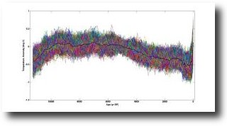 Just in the nick of time to be included in the final draft of the IPCC's Fifth Assessment report, we get...the new Hockey Stick, a paper by Marcott et al.
Surface temperature reconstructions of the past 1500 years suggest that recent warming is unprecedented in that time. Here we provide a broader perspective by reconstructing regional and global temperature anomalies for the past 11,300 years from 73 globally distributed records. Early Holocene (10,000 to 5000 years ago) warmth is followed by ~0.7°C cooling through the middle to late Holocene (<5000 years ago), culminating in the coolest temperatures of the Holocene during the Little Ice Age, about 200 years ago. This cooling is largely associated with ~2°C change in the North Atlantic. Current global temperatures of the past decade have not yet exceeded peak interglacial values but are warmer than during ~75% of the Holocene temperature history. Intergovernmental Panel on Climate Change model projections for 2100 exceed the full distribution of Holocene temperature under all plausible greenhouse gas emission scenarios.
I wonder how those 73 proxies were selected. I wonder which proxies have that extraordinary uptick at the end. And I wonder when the uptick actually started - it looks like 500 years ago to me.
New Scientist covers the paper here. Interestingly they reckon the temperature rise began in the late 19th century.
Then, in the late 19th century, the graph shows temperatures shooting up, driven by humanity's greenhouse gas emissions.
This seems odd, because it is generally understood that carbon dioxide emissions were too small to affect the climate before the 1950s.
It will be interesting to read the paper in full.
Bishop Hill
David Whitehouse reviews the paper here.
Reader Comments (72)
The vertical axis covers a whole one degree, and the horizontal axis starts just at the point where taking it back any futher would make it obvious that it is not unprecedented at all. (See the analysis at WUWT which puts it in the larger context).
Don't they have any new tricks?
I’ve had a quick look at the data, and it seems to be a mixture of different behaviours.
One set of five series shows a peak around 9k years ago, a dip from 7k-3k and a rise to the present day.
http://i49.tinypic.com/lbogh.jpg
Another set of around thirty five series shows pretty much of nothing. It looks like random noise.
http://i49.tinypic.com/t68r4x.png
And the third set of around twenty series shows the holocene optimum we know, with a peak around 2 C warmer than today.
http://i47.tinypic.com/2uylqh3.png
(There were a few others that didn’t cover a long enough interval to make a proper comparison, I think.)
The ‘Holocene Optimum’ series have been mixed in with a bunch of ‘random noise’ series and some ‘Holocene dip’ series which has the effect of bringing the Holocene peak down to below a degree. All they have to do then is paste the instrumental temperature series on the end. (Note, the end spike is not in any of the 73 series.)
Of course, that might be saying that the Holocene peak did not occur everywhere, and that in many places the temperature didn’t change, which is how they’re interpreting it. You would need to look at the individual data sources to tell.
Whether the Holocene Optimum was global or not, it’s definitiely very naughty to splice on the instrumental record and talk about anything being ‘unprecedented’. The proxy data smooths anything going on at less than 300-3000 years (figure S18 in the SI). Apples and oranges.
Here's a bit of an oddity - while browsing Jeremy Shakun's past work, I came across some lecture slides for a presentation he did at Harvard in 2007.
The graphs on page 106 seem very similar to those being used to promote the "new" paper - the long term reconstruction on the right seems virtually identical.
Am I missing something - or is this paper just a bit more of that recycling that enviros are so keen on?
Foxgoose,
Interesting find, but in the document properties I see date created as 8/15/2012 (same for last modified), and on p. 102 there is an image of Andrew's HSI book cover, so it can't all date from 2007.
"If the uptick starts in the late 19th century it may be a proxy-instrumental splice."
Are we talking "Mike's Nature trick" here. I am unsure where the graph stops on the RHS proxywise?
Less haste, Entropic Man. The same site also lists estimated human CO2 emissions here: http://cdiac.ornl.gov/trends/emis/glo.html
Looking at the graph or the downloaded individual annual data points, I discern no clear pattern, other than the general increase.
Also remember that low resolution ice core data has been welded & smoothed, and subjected to the much discussed adjustments vis-a-vis discrepancies between age of the ice and age of the trapped air etc etc.
"Are we talking "Mike's Nature trick" here. I am unsure where the graph stops on the RHS proxywise?"
Here is a graph of the last 1000 years of all the 73 proxies, (shifted to have zero mean). Can you see the spike?
http://oi48.tinypic.com/f1bji8.jpg
Note, the present is on the left in my graph.
They perform different kinds of averaging to obtain different estimates. Prior to modern times these curves are quite close to each other. Over the last 300 years there are obvious differences. The reason for this is most likely that only a few of the proxies cover recent times.
The standard 5x5 curve is remarkable in that it shows a general decline in temperature over the last 6000 years of about 0.7 K, right up until the very last data point, which states a 0.7 K rise between 1920 and 1940 - which is where their reconstruction ends. The feature seems even odder when you read that “...at longer periods, more variability is preserved, with essentially no variability preserved at periods shorter than 300 years, ~50% preserved at 1000-year periods, and nearly all of the variability preserved for periods longer than 2000 years”.
The data they use is available in database S1. Here you can see the wide range of resolutions between the individual proxy records - as they say, far fewer of their proxy records cover recent times. Looking at the higher resolution proxies, it's quite difficult to see how their final uptick could have arisen. The individual records are generally fairly flat across the last 300 years with the exception of Agassiz-Renland and TN057-17 - both of which show an impressive uptick towards the end. Possibly the variability in the proxies has been recently in-phase, and this has generated the uptick? Hopefully some of the stats experts over at CA will be able to explain.
Mar 9, 2013 at 1:42 AM Nullius in Verba
I think I see a 20th century pattern - isn't it the Sydney Opera House? I love magic eye pictures?
Seriously, those plots are a great argument against the argument the paper shows anything other than that data will tell you whatever you want if you torture it enough.
Oopse. That last sentence got away from me, but you know what I mean.
Apparently there is something difficult to explain about the late instrumental record. Suppose, you are doing educational research into methods to improve reading ability of children. You have found for a certain program an enormous increment of reading ability, about which you want to publish. There is a problem. You began with a large group of 9644 children. At the end the size was reduced to 1603. However, you did not only loose children, you also included new ones during the study. Actually, your group almost completely changed. Were drop-out and inclusion random? No, the drop-out of children, either participating from the beginning or later included, was done on the basis of correlations between time series of their intermediate test scores. Will you find a journal with peer reviewers accepting your amazing study?
Incidentally, in case anyone hasn't noticed, there are several plots around from the official sources in which the reconstruction is overlaid with Mann 2008. It's noticeable that the high-frequency noise in the Marcott reconstruction jumps up at the start of the overlaid data. I don't know, since I haven't read the paywalled part of the paper, but my guess is that the end spike is actually Mann 08 (the one with upsy-daisy Tiljander) being included in the list of proxies. It's hard to be sure since the wiggles don't exactly match until we get near the end.
Just a general observation,
The shape of the curve mightily resembles the graph in this paper by David Stockwell.
Useful CO2 emissions graph, Mr. Hart. Thank you . It does show a dip around WW2, but probably not large enough match the Law Dome dip.
Shub,
Interesting catch -- Stockwell's 2006 article says this is a common feature of "hockey stick" reconstructions -- are there sound scientific reasons that there should be such a full "hockey team" of similar reconstructions?? (h/t Michael Mann and Gavin Schmidt who introduced that term at RealClimate, Jan. 27, 2005)
@ skiphil
Yes. The basic reason is that the so-called proxies are influenced by many factors other than temperature. As the various factors vary mostly randomly from year to year, the proxies also vary randomly from year to year. If you take a particular proxy and find a significant number of examples from around the world, then select from that a subset which matches the instrumental temperature record, what you are really doing is selecting a subset that just happened to match the temperature record, mostly for reasons having nothing to do with temperature. Thus the behaviour of this proxy subset is random once you look at periods other than the calibration period. Trees are extremely poor proxies for this reason. Moisture levels and soil nutrient levels are clearly powerful determinants of tree growth rates.
Proxies can only work if they are essentially unaffected by factors other than temperature. The volume of a thin column of mercury, for example, is quite a good proxy. So good that it was used for long time as a "thermometer".
@Alex
The surface station record since 1970 is junk beyond repair (see my comment above). This is the best explanation of Mann's divergence problem. By definition you always have proxies with the highest correlation with anything you want, even if your proxies are produced by a random number generator. These will reproduce the criterion variable by definition. This is an example of GIGO research you get if you use data that would not even be accepted by the soft sciences.
Paul,
haven't got in the details yet (still working on MBH98 figures..), but RegEM 5x5 reconstruction seems to say that the blade of standard reconstruction is very unlikely. Another interesting thing is the RegEM 'without 5x5' sigma, why is that so large compared to the 5x5 version?
The hungry caterpillar makes an appearance at Judith's:
http://judithcurry.com/2013/03/11/lets-play-hockey-again/
Only 7 of the 73 proxy datasets reach 0 BP (=1950). most of these 7 do not show any hockeystick elevation after 1850…..
http://www.klimaatgek.nl
http://suyts.wordpress.com/2013/03/10/the-hockey-stick-resurrected-by-marcott-et-al-2012/
@ Mindert Eiting:
My analysis (which is basically the same as that in the Stockwell paper referred to in shub's comment above) means that most proxy analysis is useless even if the instrumental record was perfect. There are not many proxies unaffected by factors other than temperature.
Nobody in the proxy analysis field is willing to acknowledge that the emperor has no clothes. What a surprise!
Rebuttal of Marcott et al by Don Easterbrook at WUWT: http://wattsupwiththat.com/2013/03/11/validity-of-a-reconstruction-of-regional-and-global-temperature-for-the-past-11300-years/#more-81907