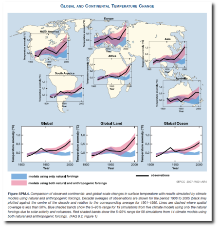
I recently emailed Richard Betts, inquiring about evidence that climate models could correctly recreate the climate of the past ("hindcasts") at a sub-global level. Among other things, Richard pointed me to FAQ 9.2 from the IPCC's Fourth Assessment Report, a continental-scale comparison of model output with all forcings (red band), natural-only forcings (blue band) and observations (black line). This figure also appears in the Summary for Policymakers as SPM 4. There is a similiar analysis at subcontinental level in the same chapter of the report.
For now I'm going to focus on the continental-scale analysis. (Click for full size)
 This on the face of it looks like reasonable evidence of some hindcast skill for a group of climate models, at least as far as temperatures are concerned (Richard says the skill is much less for precipitation, say).
Surprisingly for such an important finding, this seems to have been put together especially for the Fourth Assessment Report rather than being based on findings in the primary literature. (Richard has also pointed me to some papers on the subject too, and I'll return to these on another occasion.)
With a bit of a struggle, it is possible to find some details of how FAQ9.2 was put together: see here. The detail is quite interesting and leaves me wanting to know more. For example, here's how the model runs were chosen.
An ensemble of 58 “ALL” forcing simulations (i.e., with historical anthropogenic and natural forcings) was formed from 14 models.[...] An ensemble of 19 “NAT” forcing simulations (i.e., with historical natural forcings only) was formed from 5 models. See Note 1 below for the list of simulations. Models from the multi-model data archive at PDMDI (MMD) were included in these ensembles if they had a control run that drifted only modestly (i.e., less than 0.2K/century drift in global mean temperature).
This immediately raises the question of why there are so many more models behind the red "ALL" band than the blue "NAT" band. Surely you would want to have the same models in the two bands. Otherwise you'd have an apples-to-oranges comparison, wouldn't you?
Also, I'm struck by the sharp warming shown in each and every continent. I had always believed that the majority of the warming was in the Arctic, but perhaps I am mistaken.
Lastly, I have a vague idea that there is some history behind this figure - did Tom Wigley do a figure like this once or is my memory deceiving me?
Note: This post is about sub-global hindcasts. Comments on radiative physics or other off-topic subjects will be snipped.