An anonymous commenter has posted an interesting observation about Lord Stern's graph of wheat yields, which was the subject of a posting a couple of days ago. For convenience, here's the graph as it appeared in the Stern report once again.
;) And here's how it appeared in the original paper by Wheeler et al.
And here's how it appeared in the original paper by Wheeler et al.
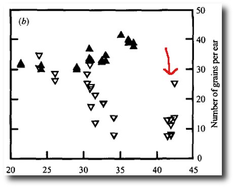
There's a great deal of interest. For example, the dog-leg interpretation of the data is not part of the original paper, but instead appears to be a bit of spin added by the noble lord. Notice also that an inconvenient data point (indicated by my red arrow) has been deleted in the Stern graph. After Climategate, readers will of course be familiar with the idea that deleting inconvenient data is a technique that is widely accepted, and indeed one that has been endorsed by many at the top of the scientific establishment, including the president of the Royal Society.
Perhaps the most important difference between the two graphs is the inclusion of a second set of data points in the Wheeler graph. These show the effects of raised temperatures on wheat maintained at elevated CO2 levels. As is plain to see, the effect of temperature seems to be more than compensated for by the enriched atmosphere. In other words the conditions we are alleged to be subject to in future are actually beneficial for wheat.
It seems surprising to me that Lord Stern should have failed to notice this good news.
 Bishop Hill